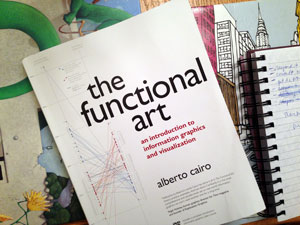
I'm an avid reader of both fiction and non-fiction. I'll take a book over television, movies, or games any day. Right now one of the books I'm really enjoying is The Functional Art: An introduction to information graphics and visualization. It's written by Alberto Cairo, one of the folks who attracted me to graduate school at the University of North Carolina School of Journalism and Mass Communication. (Now he's moved on to the University of Miami). I didn't have the chance to learn directly from Cairo as he was on leave when I was at grad school, so I wanted to check out his book.

What I'm really liking (and I'm only on p.80) are the practical examples he offers from his own career. He also offers context and history about the field of infographics - for example, explaining the stark differences between Nigel Holmes and Edward Tufte. These two men have influenced infographics and data visualization greatly, and I was fortunate to hear both of them speak live in 2008 (not together, I can't imagine that would happen). There is value in both of their perspectives.
This book really seems to provide a nice lay of the landscape to someone new to infographics as well as some really practical direction. It has reminded me of things I forgot from my coursework already. I haven't dug into the instructional DVD yet.
My favorite quote of the book so far:
" . . .graphics should not simplify messages. They should clarify them, highlight trends, uncover patterns, and reveal realities not visible before."
I'm looking forward to reading more.