Think about the last time you used a health app. Maybe it was a meditation tool after a rough week, a cancer recovery tracker, even something like a crisis hotline website (plug for 988, it works!). Now imagine you're a trauma survivor, having experienced a life-threatening illness or the sudden loss of someone you love. That app you're using? There's a very good chance nobody thought about your trauma when they designed it.
I wrote a paper with colleagues at North Carolina State University and UNC-Chapel Hill on this. We looked at 118 studies where researchers and designers built digital health tools (think apps, websites, virtual reality experiences). Each was meant to help people who've been through some seriously hard moments. What we found is surprising and problematic: almost none of these tools were designed with a trauma-informed approach, even though the people using them are overwhelmingly trauma survivors.
What Does "Trauma-Informed" Even Mean?

Read the full paper in this journal (if you like that sort of thing.)
Researchers and clinicians in the social work field spent decades developing what's called a "trauma-informed approach." It's not therapy or trauma treatment. It's the following set of principles codified by the Substance Abuse and Mental Health Association (SAMHSA):
Safety
Trustworthiness and Transparency
Peer Support
Collaboration and Mutuality
Empowerment, Voice, and Choice
Cultural, Historical, and Gender Issues
(While the current US administration may have removed the principles from the SAMHS website, here’s SAMSHA’s Full Concept of Trauma and Guidance on Trauma-Informed Principles report that I hope you will download and save.)
These principles offer guidance on how to interact with people who may have experienced trauma. Schools, hospitals, museums, workplaces, and even kids sports programs are trying to use these principles systematically.
The “why” behind being trauma-informed is clear: if you don't account for someone's trauma history, you might accidentally re-traumatize them. A poorly worded notification could trigger a panic attack. A form demanding personal details without explanation could feel like an interrogation. A health app that takes away user control might mirror the powerlessness someone felt during their worst experience. How crappy would that be to design accidentally?
The Gap Nobody's Talking About
Of 118 studies we reviewed (this study took a long time!), only one explicitly referenced and used trauma-informed principles at all. And that was because the researchers and designers were making a complementary smartphone app for parents who were learning trauma-informed parenting skills in person.
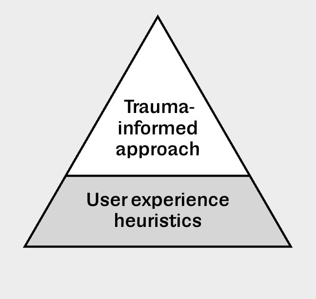
That's not because designers don't care. Many of these projects used thoughtful methods like co-design (building alongside the people who'll use the tool) and user-centered design. Some aligned with trauma-informed principles such as safety, but they weren't doing it systematically. They weren't drawing on the evidence-based frameworks that already exists
This is a bit like building a house in an earthquake zone and thinking about structural integrity sometimes, in some rooms, without ever consulting the seismic building codes that engineers already wrote. Let’s use what we know already instead of making new things up (please not another framework!)
Why This Matters Right Now
Over 70% of people worldwide have experienced a traumatic event. In the U.S. 90% of people by the time they are old will experience at least one traumatic event and more likely multiple events. That's not a small population - it’s most of us. And we're increasingly living our lives through digital technology. Digital tools are now recognized as a social determinant of health, right alongside income, education, and housing.
So when a cancer survivor downloads a recovery app, or a veteran uses a pain management website, or a teenager opens a mental health chatbot (scary!), design directly affects their well-being. Get it wrong, and you've created a digital experience that feels unsafe, confusing, or re-traumatizing. The very tool meant to help becomes another source of harm.
What Needs to Change
The frameworks already exist. Both SAMHSA and the University of Buffalo's Institute on Trauma and Trauma-Informed Care have already laid out clear, actionable principles. What's missing is the bridge between social work's knowledge about trauma and the tech world's design practices. We need to operationalize trauma-informed principles in tech.
The paper calls for more collaboration between trauma experts and technologists. It flags that AI tools, which didn't appear in any of the studies, desperately need this lens as they become part of healthcare. In schools, where trauma is pervasive among young people, students are not experiencing trauma-informed digital tools.
The bottom line? We have the knowledge to design technology that doesn't just avoid harm but actively supports healing. We're just not using it yet. For the millions of trauma survivors navigating digital health tools every day, that gap between what we know and what we do has real consequences.
If you like reading academic papers or want more detail, read our paper in Digital Health: A scoping review of trauma-informed care principles applied in design and technology.