A Letter to Content Marketing People

Dear Content Marketing People, I’m so bummed to be writing this, but someone needs to call this to your attention.

Cover of Content Marketing MagazineIf you had been watching me over the winter holidays, you would have seen me peacefully reading the December 2014 Issue of Chief Content Officer magazine published by the Content Marketing Institute. But then I read this advice on page 17:

"Consider incorporating carousels or sliders - old standbys that remain effective for promoting content."

NO!

Stunned. I flip over magazine to check the date, yes, it's December 2014. Go back and re-read. This can't be right.

I too was a big fan of carousels (sliders) – in 2009. Because I worked for a big organization, many groups wanted to be on the homepage. Carousels solved my problem. I was no longer forced to prioritize my organization's homepage content or tell anyone “No, I'm sorry, I’m not putting you on the homepage and here's why . . .” It was the easier, softer way. For that reason alone I should have known the carousel solution would backfire.

In 2012 the usability and accessibility experts started to speak out against carousels. Loudly. Multiple times. All over the place. They referenced usability and user experience research. One fine gentleman even bashed carousels by creating a carousel. I love that. The bottom line is that carousels are user-UN-friendly, frustrating, and ignored. That is not an opinion - this statement is based on research.

Now content marketing folks, you aren't alone in the carousel fan club that remains in 2015. I was brought to a non-profit conference to speak last October and did a lot of research ahead of time prepare for the talk. I learned that carousels are very common on non-profit websites. Some conference attendees did not like it when I strongly recommended against using carousels. "When you said that about carousels, I wanted to slap you," said one non-profit executive. Then she scornfully asked me what she should put on her homepage instead of a carousel (as if that were the only choice!), and I suggested one image, an information graphic, a video or some other kind of content, depending on what would be most useful to her target audience.

If you are really considering your users - the people you want to help, impress, partner with and/or sell to - carousels are NOT a good solution.

So, Content Marketing People, I beg you:

Stop encouraging the use of carousels!


And please take one of the following actions so you don’t make an error like this again:

  1.  Watch this video of a talk I gave at a recent WordPress WordCamp about to learn usability principles. Go straight to 43:18 to hear about carousels.
  2. Sign up for the weekly e-newsletter from the Nielsen Normal Group - it’s free. They reference old and new usability research studies each week.
  3. Make a column on TweetDeck for the hashtag #usability and/or #userexperience.
  4. Get some friends in the usability and user experience community. They have good information and are nice folks.

Usability is like gravity, even if you know nothing about it or want to ignore it, you will still fall flat on your face if you don’t pay attention to it. Usability can help content marketing or it can hurt it, but it can’t be ignored.

Contact me anytime to talk about usability issues. I'm here to help. Together let's make the web a better place for all.

Sincerely, Melissa

Focus on Author Experience (AX) for Great User Experience (UX)

Author experience (AX) is a critical factor that affects user experiences on websites — particularly for decentralized organizations like universities. In case you aren’t familiar with AX in terms of websites, you could think of it like this: Author experience includes all aspects of content authors’ interactions both with the website and the managers at an organization.

AX is a priority for decentralized organizations such as universities that have many different groups publishing websites and content. And sometimes the content development landscape in higher ed looks like this:

Content Landscape in Higher Ed

Helping content authors get on the same page about goals, quality, and style is essential to avoid an inconsistent and confusing user experience.

Three things that can improve AX:

  1. Training on writing, photo, and video because nobody wants to feel over their head
  2. A style guide so that there is consistency on the website
  3. Page level content strategy, since having objectives and a goal for each page leads to smarter content decisions

All three are important, but I see page level content strategy as the key to helping content authors (I’m assuming there is already a communications plan in place for the organization). For example, in a decentralized environment, it’s much easier to fix formatting issues missed (ignored?) in the style guide than to get someone to remove poor content. Once content is up online, there is something sticky about it – it’s often hard to get rid of since people are now invested and accustomed to it.

More on page level content strategy in my next post coming in January!

If you are a content author in higher ed or another decentralized organization, how can you start a conversation about what you need? And if you are a manager, what could you do to improve AX (in order to improve UX) in 2015?

5 Reasons to Love WordPress

WordPress LogoI really love using WordPress, and it's the best content management system I've experienced. Here are five reasons why: 1) Easy to use. It's more intuitive than Drupal, WebVanta, and other content management systems. I can build sites out quickly, and even update sites on my phone on the go if I need to (like fix a spelling error immediately).

2) Least expensive way to a great website. So many free and low-cost WP themes are offered with so much functionality. One-click WordPress installations are available on many website hosts. You can be up and running a solid website in a few hours for less than $25.

3) WordCamps. This is most fantastic way to meet people and learn more about WordPress. Highly recommend. Find a WordCamp near you. I'll be speaking at the upcoming WordCamp in Raleigh, NC, USA in November where you can learn how to get your website up and running.

4) WordPress community. I had a stranger in a WordPress forum solve a problem for me in minutes that would have taken me at least 12 hours to figure out on my own. WordPress users are generous with their information and show a true willingness to help others.

5) Clients can figure WP out - on their own, even if they forget everything I've told them or written out in a training document, even if they don't consult the many good sources for learning WP available online. My clients get busy and forget about their websites for way too long, but then they can come back to update them and quickly remember how WordPress works. Hmm, basically this is #1 repeated for clients. Really the ease of use is the most compelling reason to choose WordPress.

If you don't use WordPress yet, tell me why! What content management system DO you use?

(BTW I have no affiliation whatsoever with WordPress except as a very satisfied user.)

Resources for Lilly Websites Consultation Participants

Here are three items that may be of value to you: Sample three page communication plan for an academic program (Word doc download) - This can be adapted for an entire organization, a marketing campaign, an event - really anything communication related that should have goals and an associated plan to achieve them.

Slides (PDF) 

Improve User Experience Resources (PDF)

If you have questions or needs, please don't hesitate to contact me. Thank you!

If You Could Change One Thing

"My kitchen?" I responded. "I don't know... maybe more counter space?" The Home Depot employee smiled at me and realized after a few minutes that I, a person who cooks so little, would not be a great target for a kitchen remodel. But his question had certainly grabbed my attention on aisle 6 and pulled me out of my search for electrical tape.

"If you could change one thing about your kitchen, what would it be?" he asked.

Now honestly, I care very little about my kitchen, I just want it to be clean. But the situation immediately made me consider the question in regard to my website. And so I'll pose it to you, guessing that if you are reading this, you may have a business website or personal blog.

"If you could change one thing about your website, what would it be?"

I personally have an immediate answer to this - speed! I want a faster website and am trying to determine if it's worth the cost to move from a general shared hosting service (such GoDaddy or BlueHost) to a hosting platform that specializes on WordPress sites (such as WP Engine).

So I'm mulling this over now. And since I'm in the middle of a busy job with a client site about to launch in a month, I won't be able to make a hosting change to my own site immediately, but it's back on my radar screen as a high priority for October.

Your "one thing" to change might be:

  •  - ease of use
  •  - bio
  •  - examples of client work
  •  - images

Instead of getting overwhelmed about the many things you'd like to change, how could you change that one thing that bothers you the most? I suspect if it bothers you, it may also trouble your website visitors, who you don't want to frustrate. I promise that your visitors want your site to be easy to use and your information to be up-to-date.

As website usability expert Steve Krug explains in his bestselling book Don't Make Me Think, "...it's useful to imagine that every time we enter a Web site, we start out with a reservoir of goodwill. Each problem we encounter on the site lower the level of that goodwill."

Common problems I see on websites are speed, inconsistent navigation, broken links and outdated information. If you lose a visitor's goodwill, I suspect it will be harder to get them to like you, trust you, buy from you or connect with you in some other desirable way. Making your website user-friendly with accurate information matters!

Now, what's that one thing you really want need to change?

Thank you, Home Depot, for your help not only caring for my physical home but also my virtual home.

Penn State Web Conference 2014 Presentation

If you're reading this, you are probably at the Penn State Web Conference. If not, plan to be here next year if you want to learn more about higher education on the web - content, usability, marketing, programming, etc. The organizers put together a great event, and I liked the comfortable Penn Stater Hotel. Here are the slides for my presentation "Don't Be a Zombie: Communicating Your Identity Effectively" on Tuesday, June 10th at 1:30pm.

(Super gross zombie photo courtesy of Daniel Hollister, http://www.thatzombiephoto.com)

My main message to y'all: Avoid being a zombie by being mindful of your identity.

3 Things Journalists Do to Improve Their Writing

Do you write for your own website or someone else's? If so, these three simple practices that journalists often use can help you catch problems before they end up online:

1) Read your writing out loud.

When you sense you have a good draft, stop typing, and read your work out loud. You will often catch phrases that sound awkward. This is essential to do if you don't have an editor checking your work.

2) Print out your writing to review it.

For many of us, it's much easier to find errors on a printed page than on a screen. When I worked at Bloomberg News, I was encouraged to print out my articles in order to check them carefully before submitting them to one of my editors.

3) Ask a friend or colleague to look it over.

An extra set of fresh eyes will see things you can't. For example, if you are a blogger, find someone who can review your blog posts in exchange for reviewing their posts or other writing. Ask for exactly what you want. If you simply want help finding typos, say that. If you are open to getting feedback on clarity or audience relevance, say that as well. You can spend less than 10 minutes helping each other...but these few minutes can make a big difference!

Using these practices will improve the quality of your writing. Typos undermine credibility. Confusing your readers isn't going to help anyone. And if you want to learn more about writing for the web, read Letting Go of the Words by Ginny Redish.

Please share any other practices you use to better your writing before it ends up on the web.

5 Signs a Video Story May Work

A few weeks ago I wrote about how it’s important to determine your story first, then choose a good format to tell it. Your story will give you clues as to the best way to share it. If you are a business, you might be telling the story of your founding or sharing a customer experience. If you are a non-profit, perhaps your story offers why your work is important or how donations make a difference. When should you use video for a story? Based on my experience, here are some signs that video may work:

  1. A process is involved that you can show. For example, you could showcase how people use your product or the way your product is made.
  2. People in the video are engaging and confident on camera.
  3. Movement is included. I literally mean things are moving in the video - people walking, flags fluttering, children jumping, etc.
  4. Kids or animals are subjects - they are usually appealing on camera.
  5. Hearing emotion in the voice and/or showing emotion in the faces of people is important to the story.

Let’s look at a great example of an engaging and effective video:

[embed]http://youtu.be/h-8PBx7isoM[/embed]

This might be the best public service announcement I’ve ever seen. According to the non-profit’s website, this ad was created to raise awareness of the importance of wearing a seatbelt. The organization stated it didn’t want to go with the “shock and awe” approach commonly found in road safety ads. Despite a fairly simple concept and camera set up, the emotion, surprise, and slow-motion make this video very memorable. It was a creative and interesting idea executed really well.

Another place you can go for inspiring and interesting video stories is Kickstarter.

Now, think about the stories you could tell about your own business or organization. Which story can you tell via video?

One Major Content Strategy Idea that Most Businesses Have Backwards

If you remember nothing else about this blog post, take away this:

Story FIRST, then format

I talk with small business owners every week who have this backwards. Recently, I had a typical conversation with a retail business owner who had a few online videos on his website:

Me: “Tell me about these videos.” Biz Owner: “We had to create videos. You know, people really want to watch videos, we had to do it.” Me: “I’m not getting any of the important things you told me about your business in these videos. They don’t match your branding or feel or have a clear message. I was confused when I watched them.” Biz Owner: “Oh. Hmm. . . . . But people like videos so I had to do something.”

Like many business owners, he had it backwards - he was choosing to use a video to tell others about his business, BUT he wasn’t clear on the story and message that he wanted to share

We know videos have extremely high abandonment rates - many viewers will leave after 10 or 20 seconds. Bad videos aren’t going to help your business at all. In fact, they just undermine your credibility.

FIRST determine what story you want to tell. Think of stories that best tell what you do and how people’s lives are changed by your business. (If you are having trouble with this, consider checking out The Story of Telling blog by Bernadette Jiwa.)

After you are clear on what the story is, THEN choose the proper format - text, video, graphic, photos or some combination of these.

Your story will give you clues as to the best way to tell it. For example, if you are explaining a process, a graphic or video might be great. On the other hand, if you are talking about a decisive moment in your business history, a photo and text combination might work.

For example, a young woman I know wanted to start a cape business. Knowing kids and beautiful capes would be involved, she made a great video for a Kickstarter campaign. Her campaign goal was $15,000. She was wildly successful and raised $45,000 to start her business. That video really helped her.

Again:

Story FIRST, then format

Burn this idea into your consciousness and make your content decisions by it. Take a moment right now if you can to think of a story you can tell about your business. Send me an email if you want to run it by me for feedback.

In my next post, I’ll talk in more detail about when a video format may be the best way to tell a story.

5 Ways to Give Your Website Some Love

It's Valentine's Day weekend, so why not take a little time to show your website some love? Here are five suggestions to improve your website quickly: 1. Check for broken links. Having links that don't work frustrates your users and damages your credibility. Don't use up the goodwill of your site visitors on something easily fixable like broken links. There are free broken link checkers online such as: http://www.brokenlinkcheck.com/

2. Fix spelling errors. Quickly find spelling errors on your website with this website: http://respelt.com. Fix any errors to boost credibility and show you are detail oriented.

3. Update something, anything. Take a moment and see if you can freshen up just one thing on your website. Do you have a news item you could put up? Do you need to change your copyright date to 2014? Do you need to change some text?

4. Write a blog post. Blogging is valuable beyond being a useful tool to drive traffic to your website. For example, recent blog posts show visitors your website is up to date AND allow them to get to know you better. Both reasons encourage visitors to come back to you because they position you as someone current and approachable in your area of expertise.

5. Make sure you have a recent headshot. We know from usability research that website visitors scrutinize real photos of people and that a photo also adds credibility. But you need to make sure your headshot is recent. No, that photo from five years ago doesn't work. Change your photo every couple of years - and more often if you drastically change your look.

What one thing can you do for your website today? A little love goes a long way toward having a better website.

Have a website? Got content strategy?

Content strategy is a relatively new term that began to be used in web circles in the late 90s. It's commonly used by many professionals now. What is it? Why should you care? Here's my short explanation of what content strategy is:

Content strategy provides useful information to your audience so they get what they want, when they want it, and how they want it. It's the planning, creation, and management of content in all forms.

If you bother to make content (create a website for example), it's worth thinking about content strategy. Simply put, you are more likely to get your goals met if you do some planning first.

Is content strategy the same as a communication plan? No. A communication plan would contain a content strategy. A communication plan is broader - it will specify overall goals for your organization, audiences, timelines, measures of success, etc.

You may be a very tiny business, perhaps a one person show, and wonder if you should be worried about this stuff. The answer is yes. You are more likely to be a successful and lasting business if you plan your communication. You will also then ensure you won't look like a zombie (book forthcoming on this topic).

If you don't have much time to devote to communication planning or content strategy, you can head the right direction by answering these questions:

  1. What is important to my organization? What values do I/we hold dear?
  2. What are my goals?
  3. Who is the primary audience I need to reach with my content? What are they like?
  4. How can I best reach them? What would they like to see?

This is a start toward a communication plan and content strategy. Let me know if you have questions or need help!

Serve More, Whine Less in 2014

Happy New Year! Just a quick blog post here about New Year's resolutions. I have a few professional ones, one personal one, but here's the overarching theme I'm embracing for 2014.

Serve more, whine less.

I need to be of service to more people and stop complaining. I feel best when I am helping people whether that is with a website, their writing, a problem, whatever! And while I understand the need to vent on occasion, I'm done complaining. It's a waste of time, and time is too valuable.

So, that's my theme I'll keep in mind for all areas of my life in 2014. What's yours?

Less Computer Time, More Productivity

Like many others, I spend a lot of time in front of a computer screen. It's increased since I've begun freelancing since I do more work and have less meetings in person than before. But I've been noticing something cool: The less time I spend sitting in front of my computer, the more things I get done in a day. 

I've been switching my schedule around and taking more breaks. One reason is to interact with others more since I feel isolated sometimes as a freelancer. Another is simply to meet the personal needs I have. Here's a typical schedule lately:

7:15am - 9:00am work

BREAK - find new location to work in

9:20am - 11:00am work

BREAK - meditate for 20 minutes

11:30am - 12:30pm work

BREAK - walk and get my daughter from pre-school and down for a nap

1:15pm - 3:00pm eat lunch and work

BREAK - 3:00pm - 7:15pm family time

7:15 - 9:30pm work more if necessary or do something fun

I'm getting a ton done by working in 60 - 120 minute intervals instead of trying to power through 3 or 4 hours straight. Sometimes I break to meditate, to go to the gym, to take the dog for a walk, or to step out of the coffeshop to phone a friend. It works! Higher productivity, less stress.

Want to learn more about this topic? See this NY Times article on mental concentration and taking breaks.

And let me know if you've had the same experience or something different!

Now for a longer break for the holidays!

Great Infographics Book

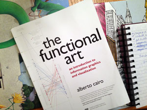
I'm an avid reader of both fiction and non-fiction. I'll take a book over television, movies, or games any day. Right now one of the books I'm really enjoying is The Functional Art: An introduction to information graphics and visualization. It's written by Alberto Cairo, one of the folks who attracted me to graduate school at the University of North Carolina School of Journalism and Mass Communication. (Now he's moved on to the University of Miami). I didn't have the chance to learn directly from Cairo as he was on leave when I was at grad school, so I wanted to check out his book.

The Functional Art Book cover

What I'm really liking (and I'm only on p.80) are the practical examples he offers from his own career. He also offers context and history about the field of infographics - for example, explaining the stark differences between Nigel Holmes and Edward Tufte. These two men have influenced infographics and data visualization greatly, and I was fortunate to hear both of them speak live in 2008 (not together, I can't imagine that would happen). There is value in both of their perspectives.

This book really seems to provide a nice lay of the landscape to someone new to infographics as well as some really practical direction. It has reminded me of things I forgot from my coursework already. I haven't dug into the instructional DVD yet.

My favorite quote of the book so far:

" . . .graphics should not simplify messages. They should clarify them, highlight trends, uncover patterns, and reveal realities not visible before." 

I'm looking forward to reading more.

Three Reasons to Go to WordCamp

Wordpress Logo I had a fantastic weekend attending WordCamp Raleigh, a conference for those using or working with WordPress (WP). Just in case you don't know, WP is an open source content-management system and blogging tool based on PHP and MySQL. I use it to run my website and those of my clients.

I learned a bunch of helpful things at WordCamp - plug-ins and e-commerce tools and even some of the history of WP. There were three tracks of sessions you could attend - users, power users, and developers - lots of options no matter what your level of understanding of WP is. Some folks had been using it for years (WP has been around 10 years,) but others had just started exploring it two weeks prior.

Here are three reasons to go to a WordCamp:

1) Ubiquitous use. Approximately 20% of the websites in the world are run on the WordPress system from tiny blogs to major sites like CNN. Even if you think you don't want to use the WordPress system, it's good to understand it so you can compare other systems to it. How else will you know if WordPress is right to use for your business or blog (or those of your clients)?

2) Unbelievably friendly users. Maybe it's the open source thing, but wow, I was impressed by how forthcoming and helpful WordCamp speakers and fellow attendees were. The conference organizers were on site and very nice as well. The event was organized but informal, which I liked.

3) Unbeatable value. Professional development was a stellar deal for a mere $35 conference fee, which also included lunch and a t-shirt. And I was able to sit down with and ask questions directly of core contributors to WordPress. All of my questions were answered, and during the various sessions, I was exposed to features of WordPress that I was unfamiliar with. Super helpful.

So, go check out the upcoming schedule of worldwide WordCamps and see if you can attend!